Sarah Marsh Salon
A website redesign for a local hairdresser.
Overview
Sarah (they, she) is a local hairstylist located in Ballard, Seattle, who has been in the business for over 10 years. As a one-person salon, Sarah's online presence is a key component to their business but clients said the website was difficult to navigate. I conducted market research and tested various prototypes to arrive at my final redesign.
Challenge
How might the website be redesigned to better communicate Sarah's strengths and services while showcasing their personality?
Role
Usability testing, visual design, low-hi fidelity wireframes, prototyping, user research.
Toolkit
Balsamiq, Sketch.
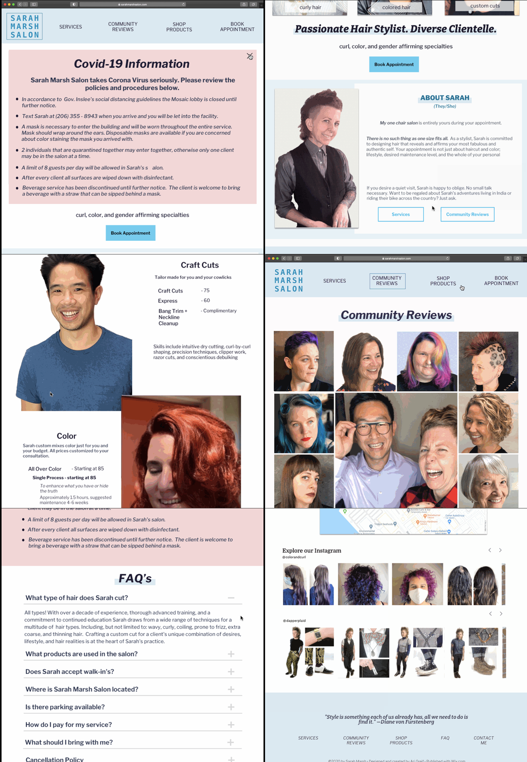
Sarah Marsh Salon Website
Current State vs Proposed Redesign
Client Research
I interviewed 27 individuals, consisting of existing and potential clients, to understand what people look for in a hairdresser, in a salon website, existing pain points of the site. It became clear that the redesign must have three main components:
1. Clearly Delineated Sections
The current one-page design was messy and crowded. People claimed it difficult to navigate and to find information.
2. Showcase Sarah’s Personality
Sarah’s personality needed to shine throughout this redesign. Existing clients mentioned that Sarah’s personality was a major factor to their continued return.
3. Address Pain Points
Clients wanted to easily find prices, booking, and services information.
Moodboard
Sarah has a broad range of skills including cutting hair in masculine and feminine manners, doing dry cuts for curly and textured hair, as well as specializing in bold and natural color techniques. Sarah does not inhabit one specific niche and the redesign needed to reflect Sarah’s broad range of skills. I conducted comprehensive research on a wide array of salons to see how they present their specialties and their salon information.
Ideation & Prototyping
I created six different content designs, and after presenting them to Sarah, we decided on a seventh.
My design goals included:
Separating content into different pages for easy navigation.
Highlighting services, products, community reviews, and booking in the top menu for easy identification.
Redesigning the home page.
Integrating social media.
After testing I identified some areas that needed to be changed.
The hamburger menu was considered an untraditional feature in a desktop design and was removed. The COVID-19 procedures were not easily found and were moved to the top of the FAQ page.
Clients found the original site organization confusing and difficult to navigate. Clients were able to navigate the site more easily with the redesigned sitemap.
Moderated Testing of a High Fidelity Prototype
I ran 7 moderated tests where participants ran through scenarios to test the redesign. They were asked about their impressions of the site, of Sarah’s personality, and how they would navigate the site.
I derived four conclusions from the results:
1. The new sitemap reduced confusion with the exception of the ‘Contact Me’ page which was hard to find.
2. Users anticipated a Covid-19 information banner upon entering the site.
3. Sarah’s personality was recognizable through page content and photos.
4. The photos included on the Services and Community Review pages showcased Sarah’s wide range of skills.
Final Design
"Sarah's clients are unique individuals who are looking for a custom salon experience. Not the run-of-the-mill salon."
"I like how the site emphasizes actual clients. The layout is streamlined without being minimalist or austere.”
Reflection
Working with Sarah was a fun experience. It was important to maintain Sarah’s brand, highlight their broad range of skills, and display the inclusive and vibrant community they have built throughout their career.


