IBD Umbrella
Helping people with Inflammatory Bowel Disease (IBD) understand their symptoms.
Overview
I conducted user interviews, designed prototypes, and administered user testing to design a symptom tracker app for patients with IBD.
Challenge
How can I design an app where users with Inflammatory Bowel Disease (IBD) can learn about the relationship between what they eat and the symptoms they feel?
Role
Usability testing, visual design, low-hi fidelity wireframes, prototyping, user research.
Toolkit
Sketch, InVision.
IBD Umbrella is an app that provides a quick and easy way to track symptoms.
Abdominal Symptoms
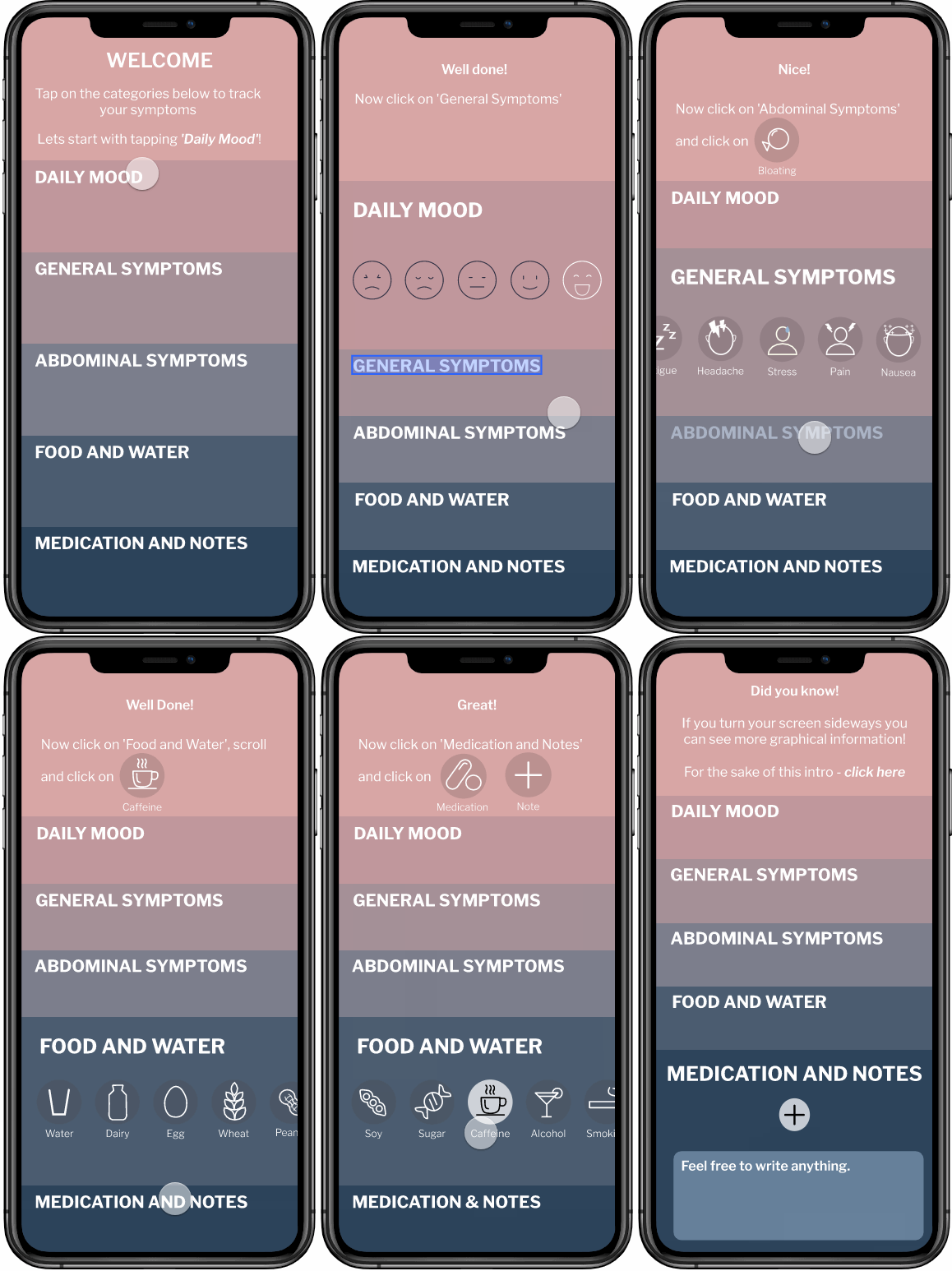
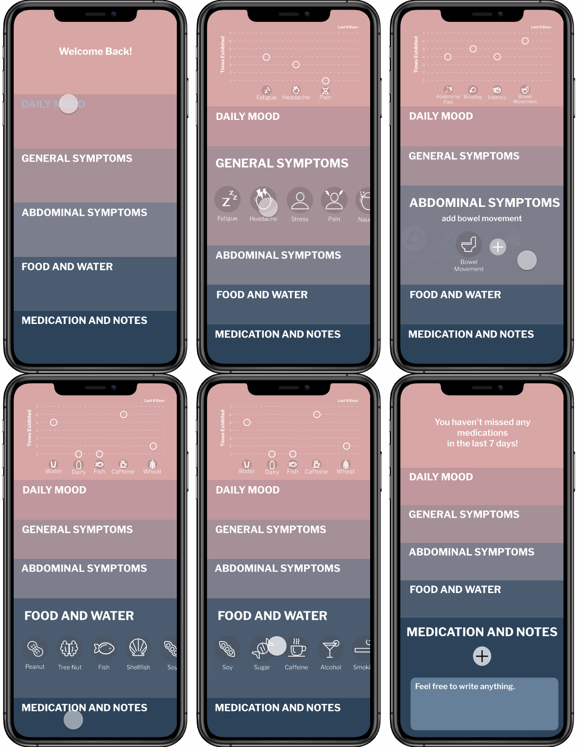
Users track their daily symptoms, including their daily mood, their general symptoms, and their abdominal symptoms.
Food and Water Symptoms
Users track their daily food and water intake.
Graph of Symptoms over Last Seven Days
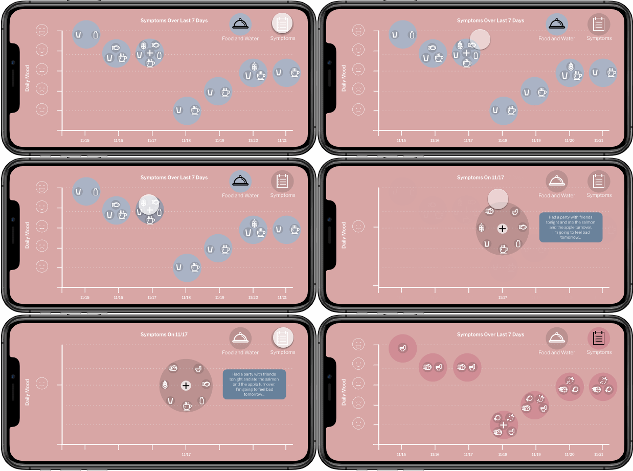
Upon turning their phone sideways, users see a graph of their symptoms over the last seven days
Research Insights & User Testing
After speaking with two friends who have intestinal bowel disease I learned that neither of them ever used a tracker app to identify their triggers. There wasn’t anything geared toward their needs when they were first diagnosed.
"[I stopped tracking because] it's too difficult to maintain."
I interviewed 7 people with IBD to understand if they shared this problem. These individuals ranged in age from their 20’s-70’s and I learned about their symptoms, how and when they track their symptoms, and what they find important to track.
Many said that tracking their symptoms was too difficult to maintain.
I conducted competitive research to see what tracker app are currently on the market and what features they provide. There are only a few apps geared toward intestinal diagnoses. These apps are comprehensive, covering everything an IBD patient might be feeling while also offering many avenues for the user to personalize and tag their daily symptoms.
However, I learned users would lose interest if the app took a long time to complete. The more details and features included in an app the more likely a user will lose interest in completed the tracker daily. Therefore, it became a priority to have a targeted, but streamlined, app.
1. Available tracker apps are too time intensive to maintain.
2. The market need is for a targeted, streamlined app.
3. Users desired a graphical representation between food intake and symptoms.
Concept Creation
Rooted in my research, I created a concept that centered around five main categories and two graphs.
Portrait Mode:
Portrait mode contains five main categories where users can mark their daily symptoms, and a small graph highlighting the number of time the symptoms occurred in the last week.
Landscape Mode:
Landscape mode showcases the same graph in a larger format for the improved visibility.
Concept Testing
Concept was ranked on initial reaction, relevancy, and likelihood of use.
Users found the app had a good balance between relevant details and ease of use. However, users wanted multiple ways to see their data which was not available in this prototype.
1. Testing showed the concept struck a good balance between having relevant IBD symptom choices while being streamlined.
2. Testing indicated that users wanted multiple representations of their symptoms.
Prototyping and User Testing
I divided the prototype into three different sections: the welcome walkthrough, the main app, and landscape graph. New problems were raised in the next round of user testing.
Welcome Walkthrough:
Users are prompted to complete a walkthrough upon first encountering the app.
Problem:
Users were confused that they were not directed through all categories. The landscape graph explanation was too vague and did not include any data. Users did not understand the purpose of the landscape mode.
Solution:
I created a more thorough walkthrough where users are prompted to click on icons throughout each category and a more thorough walkthrough of the landscape graph.
Main App:
The main function of the app is in portrait mode. This includes five categories as well as a small graph which is found on the top of the screen.
Problem:
The graph on the top of the screen is too small and the Medication category assumed everyone took daily medication.
Solution:
I increased the size of the graph and the app no longer assumes a user would take daily medication. To make it more clear that users can take notes the title of the Medication category was changed to Medication and Notes.
Landscape Graph:
A graph, of the users symptoms and food intake over the last week, is visible when the user rotates their phone and enters landscape mode.
Problem:
Users wanted to see information on a day-to-day basis and also desired a way to see any notes they have written.
Solution:
The graph was changed so users can click on the symptoms for a specific day and see all their information in one place. This new area also showcases any notes a user may have written.
"I'm actually really excited to use it. I want to see this in the world! … I like that it's easy. I feel like it would be something that would be really easy to pick up at the end of the day, or it would be easy enough to access it throughout the day."
-27 year old with IBS
Final Design
Welcome Walkthrough
Main App
Landscape Mode
Reflection
IBD Umbrella had a positive impact when shown to potential users. Many wanted this app for themselves and thought it would help them with their symptom management. In the last round of prototyping, 87% of users ranked this app either 4/5 or 5/5. Users liked that the app was targeted toward their disease and that it was quick to complete.
Next Steps…
Some additional features to include are:
Enabling users to see their data over various time spans, such as over the last 14 day, 30 days, or handful of months.
Including medical insights to increase users’ knowledge of their illness.
Adding a feature where users can export their data to give to their medical provider.
Conducting additional testing to determine if users are interested in adding the severity of their symptoms and when their symptoms occurred to the app.


